Background
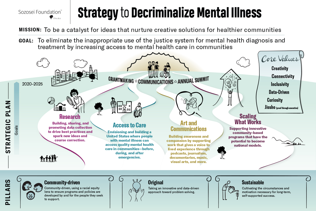
One of the best uses of visual thinking is when it can be used to communicate complexity in a clear and simple way. That’s why, when originally presented with a series of slides about the Foundation’s core pillars, beliefs, communications framework and more, I decided to create a strategy map instead: a visual history all on one page that communicates the complexity of the Sozosei Foundation’s strategy and vision to decriminalize mental illness.
And why not? In Japanese, sozosei (“SO-ZO-SAY”) means creativity.
Iterative Process
In the studio, and working collaboratively with my client, we began by determining what stories the Foundation wanted to tell:
- History: the transformation within a short period of time of where they came from, where they are now, and where they’re going
- The strategy story: their vision, what makes them different from other philanthropic organizations, and the strategic choices that will create their future state
Next we considered the audience. Who would be looking at this, and what did they need or want to know?
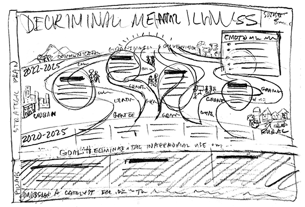
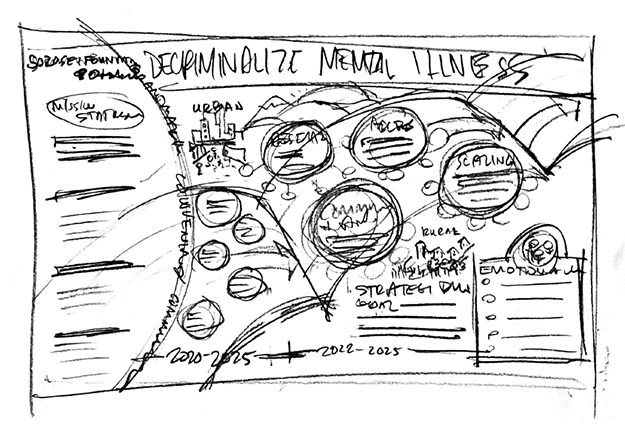
Then I started with some rough sketches to see what visual thematic directions we wanted to explore, and decided upon a journey or roadmap, indicating that the journey doesn’t end at any fixed endpoint.
In terms of style, I wanted to combine a traditional infographics look using computer-based layout with hand-done drawings and doodles to make the complexity of the information accessible as possible to readers.
Results
The result is a a living document with a panoramic view that can be adjusted periodically to keep pace with the Foundation as it continues to evolve. Learn more about it on their website.


