When an Upstate NY organization revolutionized its strategy in order to stay on mission, we jumped in to help.
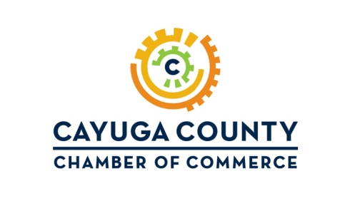
With a new executive director, new office space, and a new strategic plan, the Cayuga County Chamber of Commerce needed a newly imagined logo to let everyone know that things had changed.
In our Discovery Process, we learned that the Chamber’s constituents saw it as a social organization. But it’s really an advocacy and business development organization.
So we looked for active, bold, businesslike images, and avoided anything passive, soft, or pastoral. Our three suggested designs focused on three concepts: “Voice of the Business Community,” “County-wide Reach,” and “Collaboration.”
The Chamber went for “Collaboration.”
Our inspiration for that design came from the executive director, who told us that “the Chamber is the cog in the wheel that sets the business machine in motion.” That image set our imaginations in motion!
In the design, each wheel represents one of the three Cs of Cayuga County Chamber. The central “C” shows the Chamber at the dynamic center of things. And we chose a strong “Neutraface” font to mirror the circular shapes in the logo.
The bright, multi-color palette reflects the energy of the Chamber’s diverse membership, as well as the area it serves. Blue for the water that brings tourists to the Finger Lakes, green for the beautiful farms and forests, and oranges and yellows to illustrate the vigorous arts and culture of the area.
That beauty and energy now appears in the Cayuga Chamber of Commerce logo.

