I’ve got branding on the brain – because I’m in the midst of several branding projects and also because I gave a workshop last night on the topic at Alternatives Federal Credit Union in Ithaca, NY. Here’s a short excerpt from that talk.
….
If you are in the process of working with a design firm on a new logo design, here’s a handy list of criteria to determine whether your visual brand identity is effective or not. Is it:
Flexible?
Meaningful?
Authentic?
Differentiated?
1. Meaning
Meaning may not always be readily apparent. I think that’s OK, as long as the meaning is there and the logo is not mere eye candy. For ex, do you know what the Nike logo represents? That famous Swoosh represents the wing in the Greek Goddess of victory, Nike.
2. Authenticity
The design must be appropriate to your company, your target market, and the business sector in which you operate.
So for example, when I designed this logo for Fort la Presentation Association – a small regional association that is in the heritage tourism sector (they are reconstructing an authentic French & Indian war fort on the St lawrence River in Ogdensburg, NY) – I probably don’t want it to look like a logo for a contemporary art museum. This is reflected in the STYLE of how the logo is constructed – typefaces I chose; colors; even how the icon is rendered.
The brand should reflect your personality and be appropriate to your industry you’re in and your client’s expectations. Are you:
-an innovator? show Creativity & flair
-experienced and reliable? show Quieter and conservative
-high cost/high quality? show Visual elegance, rich imagery
(thanks to fellow designer Lauri Baram for her inspiration here!)
3. Flexible
Your visual identity must work well across media, scale, in black and white, and color.
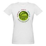
In this example, we designed this logo for an environmental organization in NYC who has started to offer several products featuring the new design. We’ve also spotted it around town on kiosks, canopies, a carved pumpkin, and even the side of a building!
4. Differentiation
In marketing speak, this is sometimes knows as your Unique Value Proposition or Unique Selling Proposition. For instance, if you consider water bottle packaging – those companies have done a good job convincing consumers there’s a difference amongst waters that by now have been revealed to mainly be tapwater. But generally there IS something unique about your company, and you need to identify what it is.
…
More on how to arrive at THAT realization in a future post –


