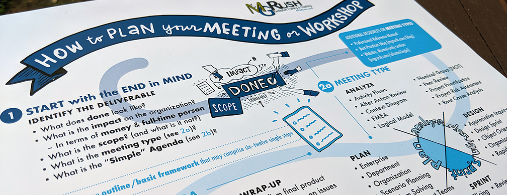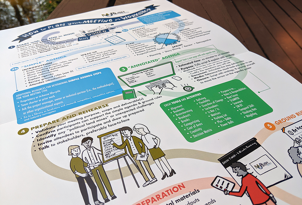
Here’s an interesting – and challenging – project I recently completed: the How to Plan Your Meeting or Workshop process map. This step-by-step infographic provides a color-coded, single-page pathway to the significant components of an important meeting or workshop.
Background
This past spring I earned a certification as a Structured Professional Facilitator with the goal of familiarizing myself with facilitation leadership tools and methods in order to offer Graphic Facilitation as a professional service, and to support collaborative efforts with Facilitators as partners.
There was a LOT of unfamiliar content for me to consume (the phrase ‘to drink through the fire hose comes to mind’). During the 4-day immersive course I took copious notes. I turned my written notes into this digital sketch upon returning to my studio, which helped me visualize and process everything I had learned.
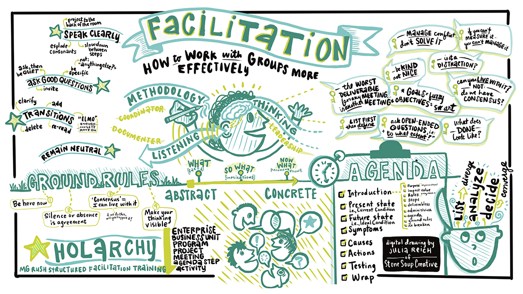
I had also been taking Brandy Agerbeck’s comprehensive 90-day online course The Agerbeck Method, so I was actively practicing drawing and visual thinking methods I had recently learned into this sketch
But I wasn’t satisfied. There was so much to know and remember. The manual for the course was voluminous and it was difficult to locate information and resources. I wanted to see the entire simplified process – something visual. I contacted Terrence the trainer at MG Rush Facilitation Training & Coaching to see if he’d be willing to work with me, and he readily agreed, saying, “Over the years, students and alumni have clamored for a simple reference sheet of our curriculum and how to prepare for a meeting.”
Client-provided content
First, I needed content, and he obliged by sending the following ideas:
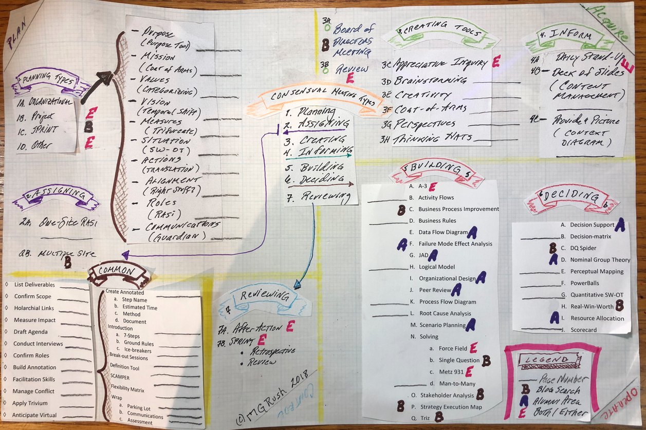
On the phone Terrence patiently answered all my questions about the content of the collage: the significance of the colors; where the eye should move sequentially in the layout; the meaning of the four terms in each corner. I didn’t take anything for granted. If I was going to design it, I needed to understand it.
Through my questioning he also realized there were areas that could be simplified, so he further refined his sketch:
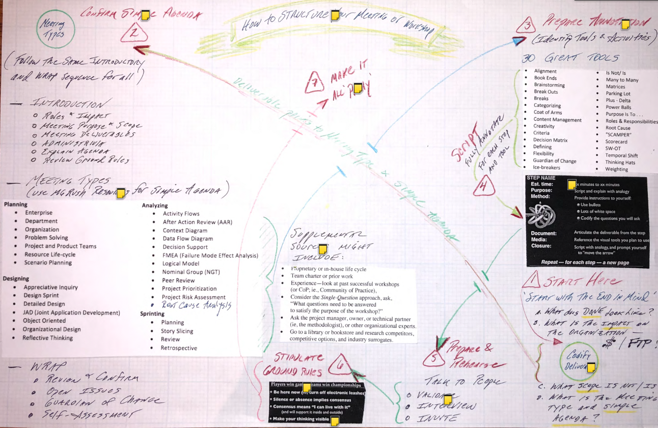
Achieving simplicity was paramount. My goal was to achieve the highest level of accuracy and accessibility for the greatest number of viewers using mostly visuals and a minimum of words.
I asked him to walk me through it again. This time I was nitpicky about the choice of certain words and phrases. For example, what does “codify” mean in this context? Could we eliminate superfluous words, or even entire sections?
Initial Sketch
After I mostly grasped the meaning of his last sketch, I made a very rough one of my own.
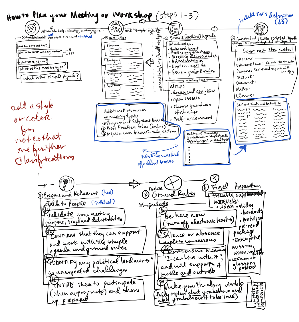
I considered different structures. I wasn’t sure what direction (literally) to go in. Starting with Step #1 on the bottom right, then bouncing to the top left didn’t seem like an intuitive way to view a visual process. I decided to start on the top left, which is where western readers naturally begin to read a page. Following that initial hurdle, I then made a hundred more tiny design decisions.
Iterations and Final Design
I liked the idea of color-coding each chunk in the process that were in the original sketches, which made it easier for the eye to follow. I drew a path winding from step to step to make a visual connection (Think Candy Land, or The Game of Life, or a multitude of other Milton Bradley board games from my childhood which shaped my visual sensibilities).
I drew all the artwork on my iPad and imported each drawing into Adobe Illustrator on my computer. This is where I did all the text editing and fine-tuning of the layout, which resulted in the final version.
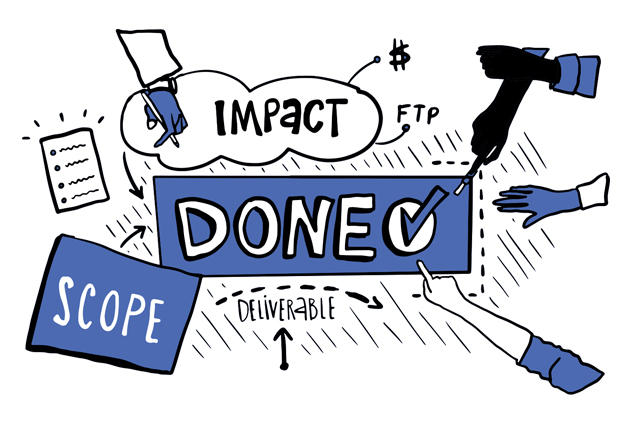
There are a few lingering concerns. For instance, I was in favor of including page numbers for the Tools and Activities in Step 3, which would refer to a description of each in the accompanying training manual each student receives when they attend the course, but this did not make into the final map. And is it okay that my hand-drawn style doesn’t especially jive well with MG Rush’s more corporate aesthetic? Finally, I also still find it quite wordy and complex to maneuver. But, it’s a place to start, with refinements to be expected as we gather feedback from facilitation training students, alumni and other users.
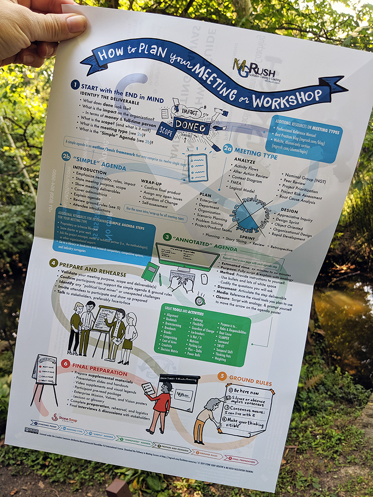
The final version is a large 24-in x 36-in poster which contains more content, larger text and graphic elements. I also made an 11-in x 17-in version (shown here) that is less costly to print and easier to distribute.
What do you think? Can you follow along? Are you an MG Rush alumn, and do you find it helpful? What could be improved in v2.0? Please comment below.
For more about the Meeting Pathway, read all about it on the MG Rush blog.
Want more on Visual Communication and Visual Thinking? Here's some related content for you.
Top Ten Doodles for Visual Communication
Drawing out concepts and ideas instead of writing down words is an effective way to communicate. Doodles are simple shapes and symbols that can be drawn in all kinds of situations. Plus it’s fun, and you don’t need to be an “artist” to do it.
