How to do you know when it’s time to re-brand?
Maybe your group has new leadership, and they’ve decided it’s ‘out with the old and in with the new’… or your mission has changed over the years, and your new identity isn’t representative of who you are now… or you’ve got a new program and it needs its own identity… or your name has changed because it was confusing and outdated… or there’s a dozen different versions of the logo in use, and no one knows where the original file is… or everyone is in agreement: the current logo is just plain ugly.
Whatever the reason, in spite of your best efforts at getting the message out – from your website, to email, to print communications, to fund raising events – you realize your efforts could be more professional, accurate, resonant, and consistent. Then it’s time for a re-brand.
What does re-branding entail?
Which aspect of the re-branding process should you undertake? The branding spectrum could encompass several aspects, from a simple logo tweak to a full-scale organizational re-branding program that takes into account positioning, messaging, tagline creation, and visual identity. The latter is a more comprehensive process that generally occurs with a startup organization, right from the outset, or in response to a strategic planning process the organization has conducted.
Post- strategic planning
Such was the case with a recent client of ours, Cayuga County Chamber of Commerce, located in central New York state. My team was brought on board to design their logo after they had gone through a strategic planning process. They also had a new office space and new, young leadership. They wanted to make a statement that CCCC was a different organization than they were before: “A fresh perspective, recognized as a business leader, doing things different, now we need a different look and feel,” reported Executive Director Andrew Fish.
Similarly, Ohio Grantmakers Forum, a group which inhabits a small niche of the nonprofit world – a regional association of grantmakers — has been working for the past two years to plan strategically for how to adapt to the changing philanthropic landscape.
“One of the key results of this work is our decision to add new types of members to our statewide association, so that in addition to foundations we will now include individuals, giving circles and United Ways in our membership. We know we need to rebrand ourselves – with a new logo, tagline and website – while expanding and updating the key services that have made us successful during our 30-year history,” says Claudia Y.W. Herrold, OGF’s Vice President, Communications & Public Policy.
While OGF readies itself for this process, part of their re-branding has already occurred – a new name change – which will be officially announced later this fall.
When a program casts a long shadow
The Union Square Greenmarket – the largest and most successful open-air farmers market in the country – is a New York City icon, but few people are aware that this was a program of the 40-year-old Council on the Environment of NYC (CENYC).
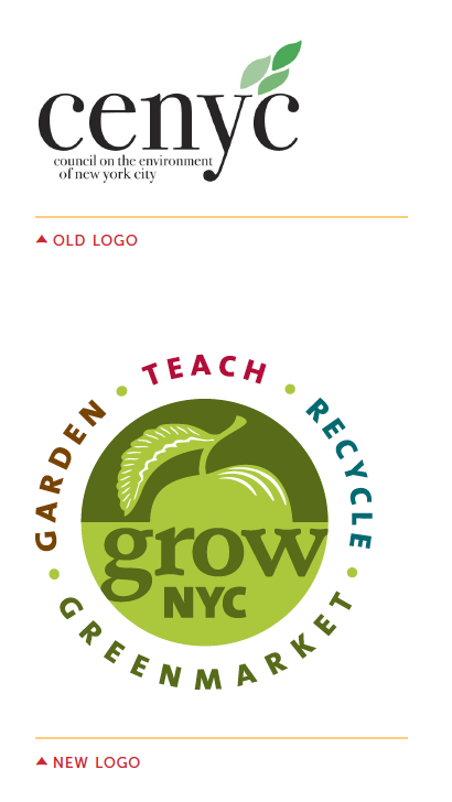
“CENYC? What’s that?” would be the response of most New Yorkers when asked about the Council. As a result, the Council lost opportunities to engage people in its programs and to raise money from donors, many of whom didn’t grasp the full scope of the organization’s work. To address this need, the Council decided to undertake an initiative to rename and rebrand the organization for greater recognition by New Yorkers.
Thus GrowNYC was proposed as the new name for the organization, and in 2010 we were hired to design their new visual identity (below). The words around the logo – teach, recycle, greenmarket, garden – directly reference the organization’s program areas and are space-efficient. Unlike the old logo, this new look is accessible, and has a “home-grown” feeling that reflects the grassroots nature of GrowNYC’s work. This now looks like the kind of organization people want to get involved in.
About the efficacy of the re-brand, Amanda Gentile, GrowNYC’s Development and Communications Coordinator says,
“It is absolutely true to say that since rebranding, the name GrowNYC has appeared in the media much more frequently. In the past, when a writer was reporting on a greenmarket they would never have mentioned Council on the Environment of New York City. Today, we see ‘GrowNYC’s Greenmarket program’ or ‘Greenmarket, a program of GrowNYC’, much more often. More importantly, in general, we have appeared in the media more frequently than in the past and I can’t help but think that our name and mission are much more visible and understood, thanks to a concise logo/name, and therefore folks latch unto us and are intrigued by our work enough to cover it.”
(Interested in learning more about this project? Read a full case study here)
Excuse me for a moment while I freshen up
Sometimes a few tweaks are all that’s needed to make a logo appear more polished and professional. That’s what former client West Wind Consulting Strategies in Fund Raising, a consulting firm providing fund-raising advice, requested – “to look more in line with the times”.
Original artwork for the old logo couldn’t be found, so we scanned it from letterhead and re-created it from scratch. The new version features:
- fewer “wind scrolls” to make the logo less fussy;
- an updated typeface looks more legible and modern; and
- an addition of the second part of their name, set below the main logo, in small text.
When the old brand is out of synch
Sometimes you know it’s time for a re-brand because your organization’s mission, vision, and personality have changed over the years, and your logo no longer reflects who you have evolved to become. That’s exactly what took place with onerecent client, New York Insight Meditation Center (NYI), who hired us to create a new logo and tagline.
Sebene Selassie, a former NYI Board member who was on the re-branding committee, says:
“I think we knew it was time to rebrand because we realized that our old logo of the circular hands and tagline ‘A peaceful refuge in the heart of the city’ did not resonate for us anymore as a full expression of what we had become as a diverse community dedicated to transformation. Our new logo which blends the vibrancy of the city with the beauty and grace of the lotus flower and the tagline ‘Where hearts & minds awaken’ both reflect a much more profound and holistic message about us now.”
…..
There are many indications it may be time to re-brand your organization. Regardless of your reason, and how much of the process you plan to undertake, an updated brand can be worth the effort – in order to increase visibility for your organization and its programs, create more compelling and effective communications, and reach more donors and other constituents.


