People are passionate about brands they feel connected to, and that doesn’t just apply to consumer products like cars, coffee and yoga clothes — it’s relevant to nonprofit brands too. Loyalty is the holy grail of branding, as it can lead directly to increased awareness, participation, and donations.
However, in spite of your best efforts at getting the message out — from your website, to email, to print communications, to fund raising events — there may come a point when you realize your efforts could be more professional, accurate, resonant, or consistent. That’s when you know it could be time to re-brand.
Sometimes it is time for a re-brand because your organization’s mission or personality changed over the years, and your brand no longer reflects who you have evolved to become. That’s what happened with our client New York Insight Meditation Center (NYI) — an organization based in midtown Manhattan which provides a variety of programs based on the teachings of the Buddha and rooted in the Therevada tradition.
Our client told us:
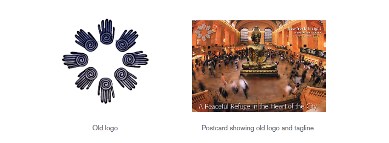
We know it is time to re-brand because we realize that our old logo of the circular hands and tagline — A peaceful refuge in the heart of the city — do not resonate for us anymore as a full expression of what we have become — a diverse community dedicated to transformation.”
With this in mind, we were challenged to create new key messages, a tagline and logo that more fully conveyed New York Insight’s values and personality.
Marketing Challenges
1/ Visual stagnation and inconsistency: The existing logo had been prepared in a hurry decades ago and held little meaning, and there was no name or other text accompanying the graphic to tie it together, resulting in confusion amongst constituents to recognize and connect the logo to the brand.
2/ Ineffective marketing: the Center had a great program lineup, and the communication materials were well written, but they lacked consistency. And in trying to appeal to everyone, their message had been watered down, sounding like all the other messages produced by similar organizations.
Marketing Objectives
1/ Create consistent messaging that highlights what makes the meditation center’s community unique — high-calibre teachers, a sense of inclusivity, and a commitment to diversity and transformation
2/ Develop a meaningful, pithy tagline that extends the Center’s brand by conveying its unique impact and value
3/ Redesign the logo, which will be expertly executed, simple, and memorable, with visual elements that capitalizes on the strongest brand values, and which will be prominently applied to all the Center’s communications
4/ Achieving financial support has been an organizational challenge. Encourage donations along with the concept — in the Buddhist tradition, of dana — an act of generosity; to give without expecting anything in return
5/ Grow the size of their audience, which includes new members
6/ Enable and empower the organization to create communication materials on their own after the branding project is completed without having to turn to Stone Soup Creative each time
The Steps Taken
In an effort to gain an understanding of where the Meditation Center was positioned in their sector, our first step was to listen, learn, and examine the organization from all angles. We conducted several modes of research in order to determine:
- What do constituents think about NYI?
- What are similar organizations doing?
- How can we best position NYI to avoid confusion with similar organizations?
Our research consisted of the following methodologies:
1/ Competitive reviews: We wanted to know how New York Insight compared with others groups with similar missions and services. It helps to know how audiences view the organization relative to others. Even organizations with similar missions may have a different way of undertaking their goals that may appeal differently to different people.
We created this spreadsheet of similar organizations’ online presence and compared their mission statement, tagline, audience, perceived strengths and weaknesses.
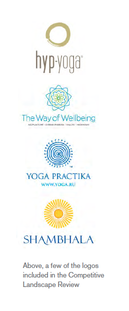
We also conducted a visual survey of the “competition” — Buddhist organizations and meditation centers of course, but also those practicing yoga and other forms of wellness.
We discovered many of these logos featured abstract, circular symbols or nature imagery, and were rendered in light line weights in pastel green and blue tones.
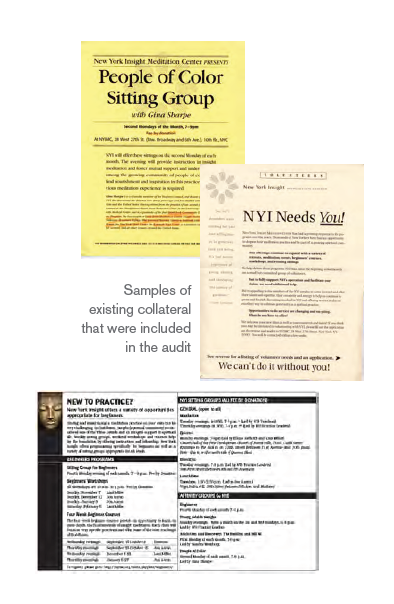
2/ Communications audit: We analyzed all of the organization’s existing communications. This included brochures, pamphlets, flyers, emails and postcards (the website was barely an entity at the time). We created another spreadsheet with columns devoted to audience, purpose, message, result and a final assessment of each piece.
3/ Surveys: We conducted about a dozen informal questionnaires, mostly with Board members and staff, but also with some NYI members and other visitors who picked one up at the front desk. The survey included about 25 questions in the following categories:
- Background
- Perceptions
- Competition
- Audiences
- Logo and tagline
Responses were collected in a spreadsheet and analyzed.
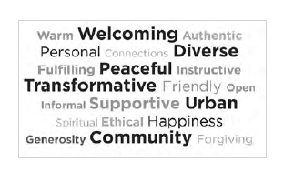
Finally, we gathered the words and concepts that cropped up most frequently in the surveys and created a word map. Clients often find it helpful to see a visual representation of their most important brand assets.
Recommendations
In the concluding portion of the Discovery phase, we analyzed the research findings and presented our recommendations to the client:
1/ We found their existing collateral welcomed everyone in equal measure. This may be a true sentiment, but in order to have universal appeal the result felt bland and watered down, and the vitality and diversity treasured by the NYI community was lost.
Recommendation: Identify NYI’s core values and create specific messaging to address them. Yes, everyone is welcome, but not everyone is the same — in essence communicating that “You’ll find a segment that’s just right for you here at NYI”. Furthermore, we suggested that NYI frame its key messages in terms of what their audiences value rather than what NYI thinks it has to offer them, by speaking to their needs and desires.
2/ The Center’s programs are highly specialized offerings that attract people for different personal reasons. Some people seek a sense of purpose, connection and community, some want to teach, and others want to find a sense of peacefulness amidst urban chaos.
Recommendation: Knowing these reasons can help NYI tailor their programs and their marketing efforts to better appeal to prospective members.
3/ We found many instances where donations were mentioned in detail — different giving levels, the concept of “dana,” the need for volunteer services, etc. and found this confusing.
Recommendation: Stakeholders are appropriately focused on getting more money, and the messages about giving are important and should be made clear. But since ‘generosity’ is not the first reason individuals step through NYI’s doors, do not focus on this as the main message. Attract people to come through your doors first for the things they find valuable.
4/ The old tagline, ‘A peaceful refuge in the heart of the city’ refers more to location than value and possibilities.
Recommendation: Use the tagline to communicate the benefits of meditation to people who may not understand it. Transformation is active and powerful — who doesn’t want to be a better person?
Brand Story
We took the information gathered and worked to uncover New York Insight’s unique story and personality in order set the tone and strategy for their brand.
First, we developed five key messages focusing on NYI’s brand assets — the group’s unique, differentiating features. Each is followed by several supporting points:
1/ Transforming Lives: Through the teaching and the practice
The teachings of the Buddha are central to the transformative nature of our center. And our caring teachers bring the teachings to life — by making them accessible and demonstrating them in a way that can be practiced daily life. By experiencing the teachings, learning, and practicing in a supportive community — our members have transformed their lives. The power of the group + the power of individual = “Together we learn, individually we transform”.
This message of transformation, achieved through the Buddhist teachings was the core element of their programs and informed everything they did. Thus the client felt it was more important than all the rest, below:
2/ Peaceful Refuge: Our center is calm and conducive to reflection
This is a place of tranquility. Here you can learn to live your life wisely, connect to your deepest values—and be mindful. Amidst our peaceful environment, you’ll achieve life transformation through meditation and the teachings of the Buddha. When you’re seeking an atmosphere of personal reflection, we have all the quiet you need.
3/ Commitment to Diversity:Members, volunteers, teachers and other supporters are an eclectic, multi-cultural group
Our community is strengthened by unique people. It’s their diversity that makes our programs and offerings so vibrant and varied.
4/ Urban Setting: Manhattan location
Unlike any other — New York City is a truly unique place. A place of exploration, possibility and new beginnings. It’s open-minded, creative and powerful. We think we have a lot in common with the city we call home. Our meditation center is strengthened by NYC’s culture, taste and diversity.
5/ Welcoming Atmosphere: Warm, friendly and supportive community
Open, friendly and accepting, we love the transformative power of a welcoming community. Each day, we see the rewards our community brings to those who create and participate in it. Whatever your goals, whatever your speed, you’ll find a supportive, safe non-judgmental environment where you can be yourself.
These talking points are “essential ideas to be conveyed”*—not meant to be used verbatim, but as a starting point for communications.
Next, we worked collaboratively with the client to develop a new tagline, Where Hearts & Minds Awaken. This took several meetings, lots of discussion, and several rounds of revisions. The new tagline replaced the old slogan, A Peaceful Refuge in the Heart of the City, which the client felt reinforced the fallacy that NYI was merely a venue or location rather than a community. Where Hearts & Minds Awaken reflects NYI’s passion and commitment to the transformative power that can be experienced through meditation and the teachings of the Buddha.
Visual Identity: Rejected & Approved Concepts
Our final step in the NYI branding project was to develop a new logo.
First, we “sketched” some preliminary ideas as form and style took shape. None of these was quite resolved yet:
Eventually we presented three logo designs to the client. We hit on several key concepts — with an accompanying rationale for our choice of color, typeface and graphics. However, none of the logos seemed entirely appropriate.
“The ideas behind these 3 logos are on track and in sync with our mission/vision but their execution is a little off,” we were told. The client was drawn to the Urban Sanctuary concept, but felt the cityscape was too generic and the overall look and feel was too lightweight. They preferred the boldness of the type and rich, warm colors from Concept A.
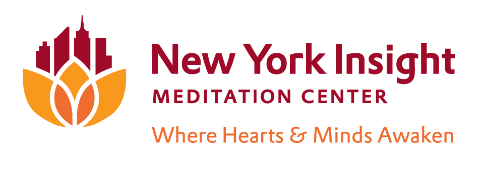
Working iteratively with the client, the logo was refined in three rounds of presentations, and a final design incorporating the new tagline was approved:
Color: A palette of warm gold, orange, and deep red tones is evocative of the spice-color robes of Theravada monks in southeast Asia, in shades of curry, paprika, and blazing saffron.
Type: Prokyon is a new Dutch Humanist typeface that is quirky, clean and modern in appearance.
Graphics: A New York cityscape emerges from — and is elevated by — a lotus flower. The lotus flower, a strong Buddhist symbol representing purity and enlightenment, is evocative of NYI’s tradition: “while rooted in the mud, its flowers blossom on long stalks as if floating above the muddy waters of attachment and desire.” The logo execution is bold — to emphasize the strength and commitment necessary to practicing meditation and following the teachings.
Outcomes
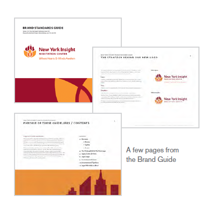
We provided the organization with a Brand Guide, an electronic manual which conveys the key messages and logo files so they can keep the look and feel of their identity consistent. Implementation of the standards helps build a strong image for the Meditation Center so their community will have an easier time recognizing their good work and and understanding the case for supporting them.
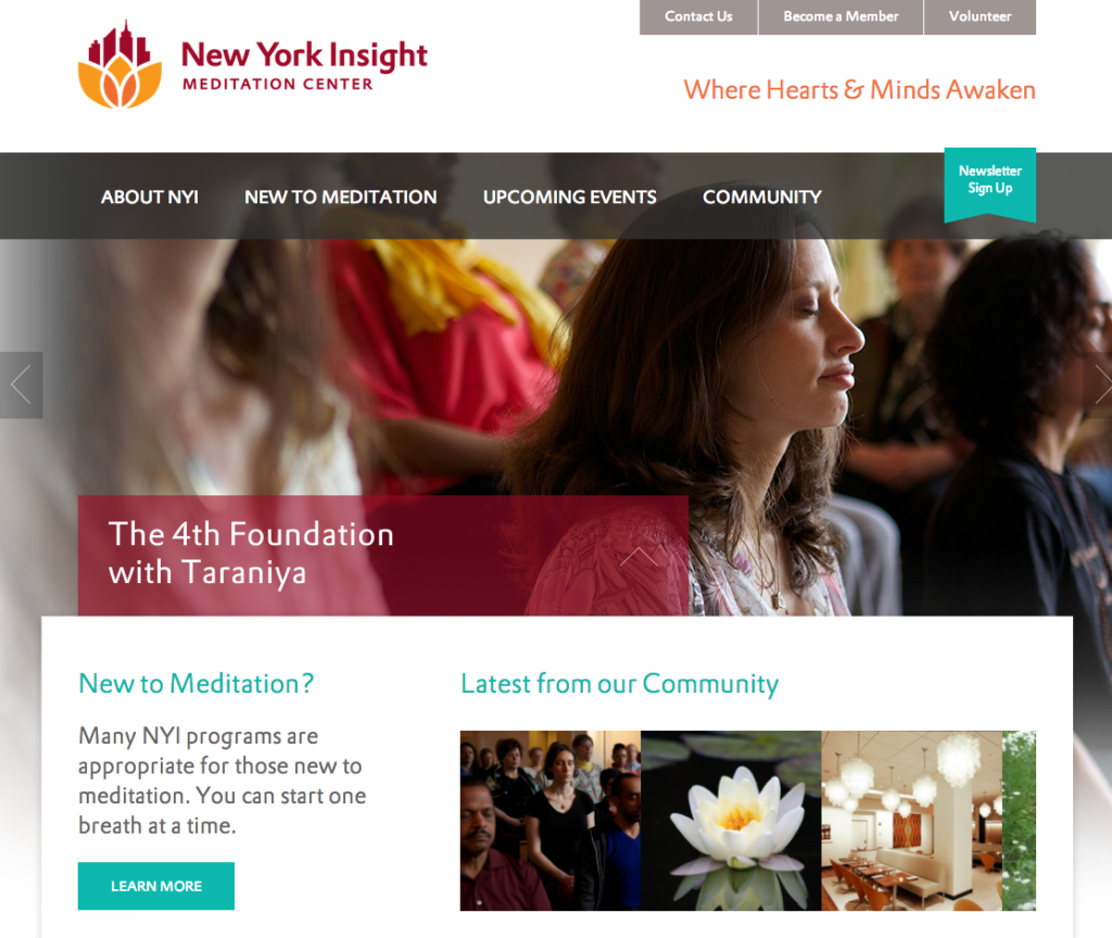
Soon after the branding project concluded, NYI began applying their new visual identity and messaging to a series of communication materials including an email newsletter campaign, website and Facebook page.
Our client reported back:
Our new logo which blends the vibrancy of the city with the beauty and grace of the lotus flower… and the tagline Where hearts & minds awaken both reflect a much more profound and holistic message about us now. Thank you for a beautiful brand identity. I always appreciate your process and its caring and careful qualities. Very much like mindfulness.”
There are many indications it may be time to re-brand your organization. Regardless of your reason, and how much of the process you plan to undertake, an updated brand can be worth the effort — in order to increase loyalty for your organization and visibility for its programs, create compelling and effective communications, and reach more donors and other constituents.
Sources
* https://gettingattention.org/articles/1875/message-development/nonprofit-message-platform.html
…
Julia Reich is a Brand Strategist and Principal of Stone Soup Creative. She oversees the creative studio on a variety of innovative branding, marketing and design projects for nonprofits, foundations and educational institutions. Julia has also been featured in several design books including Graphic Recycling and The Big Book of Green Design. Connect with her at Stone Soup Creative, Facebook, Pinterest and on Twitter @juliareich.
