How to use the four principles of graphic design to create images that engage audiences and make your organization look good
As a 20+-year professional veteran of the graphic design field – most often working with nonprofits – I believe an organization’s marketing materials need no, require good design. In my experience good graphic design has the power to:
- inspire action
- inspire involvement
- inspire engagement and giving
- create awareness
I want you to represent your organization’s work in the most professional way possible. With this in mind, here’s how to effectively communicate your organization’s mission using powerful messages and images that successfully engage donors, funders, media, volunteers and other supporters.
The Big Four: Contrast, Repetition, Alignment, Proximity
These four principles are not all there is to know about graphic design, but understanding these concepts and applying them can determine how professional and successful a piece of communications is, whether it’s an ad, poster, brochure, social media image, website, etc.
I discuss them separately but they are really interconnected. Rarely will you apply only one principle.
The elements of design are also super-important to know, but I’ll share these in a Part 2 post.

Briefly, they are:
Principles
What we do to or with the elements of design:
- Contrast
- Repetition
- Alignment
- Proximity
Elements
The items that make up a design:
- Line
- Color
- Shape
- Scale
- Texture
- Space
1. CONTRAST
Contrast simply means difference. We notice differences. It’s what gives a design its energy. Designs with strong contrast attract interest, and help the viewer make sense of what they’re looking at. Be bold! You should make elements that are not the same clearly different, not just slightly different.
You can achieve contrast in many ways – for example, through color choices (dark and light, cool – like blue, and warm – like red), by text selection (serif and sans serif, bold and light), or by positioning of elements (top and bottom, alone and together).
I find well-designed billboards are often a great example of the contrast principle because they have to capture interest and communicate a message quickly while you’re flying down the interstate.

Making use of contrast can help you create a design in which one item is clearly more important. This helps the viewer “get” the point of your design quickly. Every good design has a strong and clear focal point and having a clear contrast among elements (with one being clearly dominant) helps.

Weak contrast is not only boring, but it can be confusing. If all items in a design are of equal or similar weight, with nothing being clearly dominant, it is difficult for the reader to know where to begin to make sense of what they are viewing.
Keep in mind that every single element of a design such as line, shape, color, texture, size, and space (see above) can be used to create contrast.
2. REPETITION
The principle of repetition simply means re-using the same or similar elements throughout your design. Repetition of certain design elements will bring a sense of clarity and consistency, which can result in a more polished-looking piece.
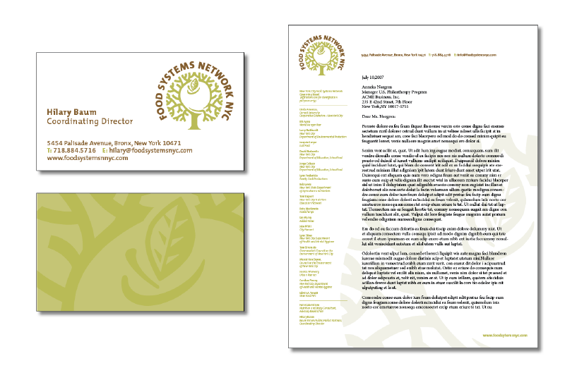
Try repeating some aspect of the design throughout the entire piece. The repetitive element could be a bold font for a headline, a certain bullet style, color, a rule (line), etc.
3. ALIGNMENT
The whole point of the alignment principle is that nothing in your design should look as if it were placed there randomly. Every element is connected visually via an invisible line (often in grid form underlying the design in a separate layer of your design software). This achieves unity.
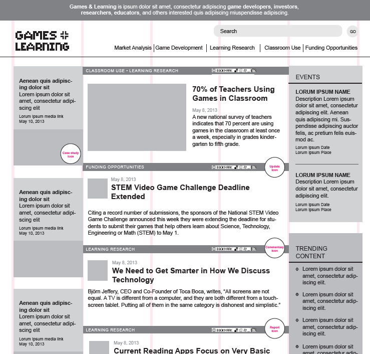
Noob designers may put text and graphics on the page wherever there happens to be space, often without regard to other items on the page. This creates a messy effect. Nothing should be placed on the page arbitrarily. Every item should have a visual connection with something else on the page, which creates order and looks cleaner.
4. PROXIMITY

The principle of proximity is about moving graphic elements such as photos, illustrations and type closer or farther apart. Related items should be together so that they will be viewed as a group, rather than as unrelated items. Viewers will assume that elements that are not close to each other in a design are not closely related and will conversely tend to think items that are near to each other are related.
Another word for this principle is spacing. The rule is to group related items together – move them physically closer to one another. The related items are seen as one cohesive group rather than a bunch of unrelated bits.
In a designed piece, as in life, physical closeness implies a relationship.
EXAMPLE
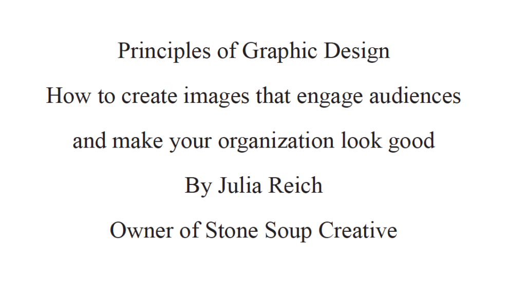
Let’s review with a re-design of a sample title slide for a fictitious PowerPoint presentation.
Right now the text below in the title slide lacks a design priority. Due to poor use of alignment and proximity the slide seems to contain five different elements:
The slide below ↓ uses better proximity, with related items now together. Greater contrast is also achieved by adjusting type size with a little bit of color variation to give the design a clear hierarchy.
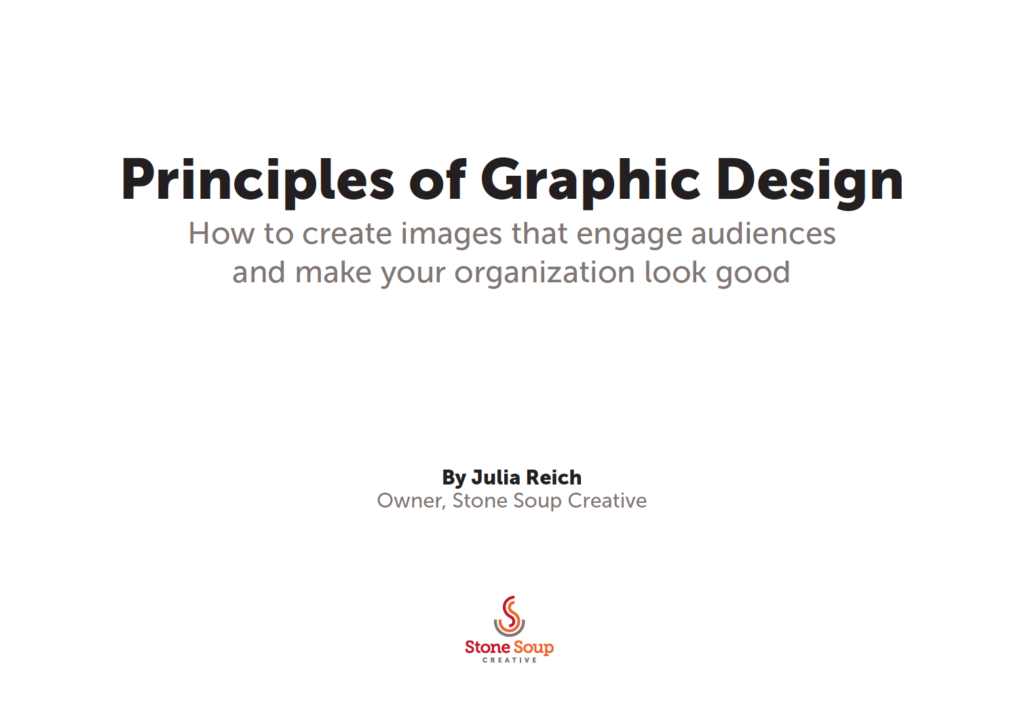
It’s cleaner, but everything’s still aligned in the center, which – let’s face it – is boring.
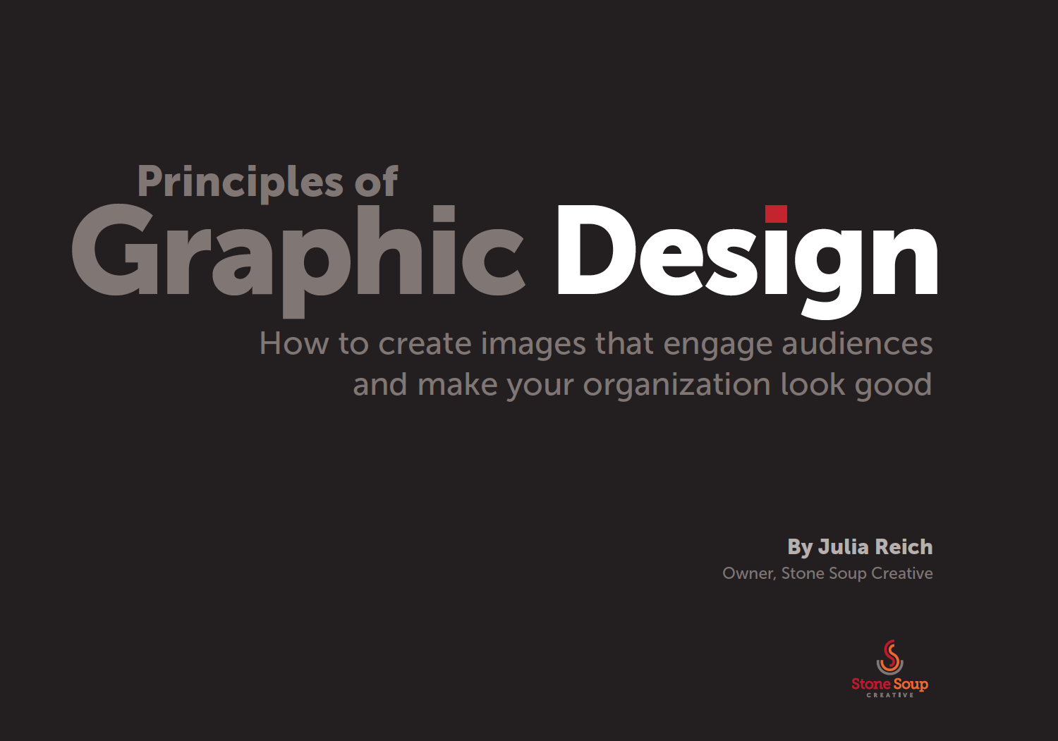
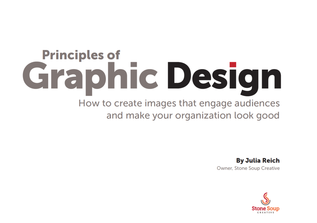
The next two slides below show that by aligning all elements flush right, an invisible line is created on the right side that ties all the elements together in a way that is more interesting than the more common centered title. Type and color are adjusted to create greater contrast and interest. The red dot in the title ties in with the logo at the bottom.
[Slide re-design inspiration from Before and After ↓]
Resources
- Before and After – One of my favorite design resources of all time. It’s great if you need to know graphic design for web pages, brochures, presentations, logos, ads, business cards, magazines, business documents, posters, and more
- Principles of Design – visual downloadable poster
- Creative Live – learn more design (and other creative stuff)

Julia is a 20-year veteran of the field of graphic design and the owner of Stone Soup Creative. She is also a branding consultant and graphic recorder. She attended Hampshire College in Amherst, MA and Pratt Institute in New York City.
Want more on Visual Communication and Visual Thinking? Here's some related content for you.
Logo Feedback Worksheet
If your organization is working with a designer, it’s helpful to know how to discuss and evaluate the designs being presented. This guide will help you through the process. Use this together with the Logo Evaluation Checklist.


Great introduction and examples regarding C.R.A.P.
After reading about these elements in the chapters assigned, this was an easy read.