If you dream of making your content more engaging so people actually read it, try adding some simple infographics. This engages the reader by making it easier for them to understand your point. It’s kind of like a visual pull-quote.
Here’s five ideas – and lots of examples – of how you can use simple infographics in a report, email, presentation or other mode of communication to help people pay attention so they get your message.
1. Include your data in a fun little graphic

[I did not design this]
Make your point more impactful with a visual that is conceptually related to your theme or cause. Two examples:
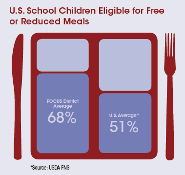
This element ↓ from a fact sheet uses an image of a lunch tray to display a statistic related to this organization’s impact on improving healthy lunches in the nation’s largest school districts.
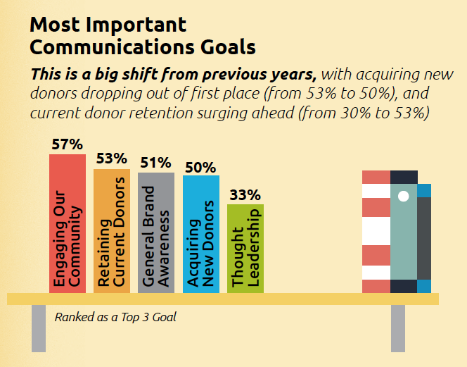
Here, a bookshelf graphic is used in conjunction with data on communication goals. It was part of a larger infographic, with an office-y theme, about nonprofit communication trends.
2. Add icons as visual cues
Icons are wee little pictures that can break up large amounts of running copy to not only make the page more interesting to read, they can also add meaning.
In this example, FoodCorps needed a visual “roadmap” to show how their Healthy School Toolkit process works.
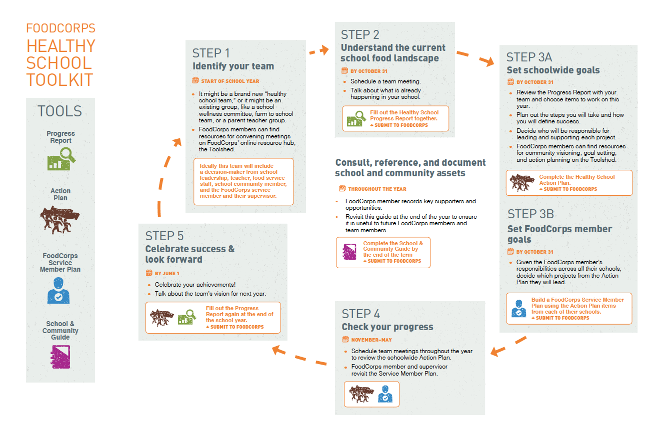 To make the process have a visual flow, we included:
- step number and title
- time frame as it relates to the school calendar
- bulleted text containing a bit of detail
- an actionable tip
- …and a circular arrow to tie all the steps together
But the Toolkit is more than just a process, it’s also a set of resources. This is where the icons came in. We designed an icon for each tool with a simple legend placed next to the main graphic. And since the actionable tip is a required step in the process, we put those in boxes along with the relevant icons so they really popped out.
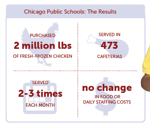
Here’s another example of a simple way to use icons, by placing them behind some numerical facts. This makes the most important stats stand out.
(See the entire poster about School Food FOCUS’ healthy lunch program.)
And this one, from a flyer for Lily School of Philanthropy. Just by pairing icons with bold data points helps break up the text a little.
Finally, in this example of average operating expenses for art museums, we used icons inside a donut chart! (Whoa, is that even legal?) See Art Museums by the Numbers.
Need sources for icons? My two favorites are thenounproject and freepik.
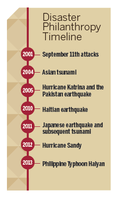
3. Create a visual timeline
If you want to show the history of something – how an organization or project started and evolved over time, for example – it makes sense to create a timeline and insert it into your report, website or presentation. Keep it simple so readers can digest the most important dates.
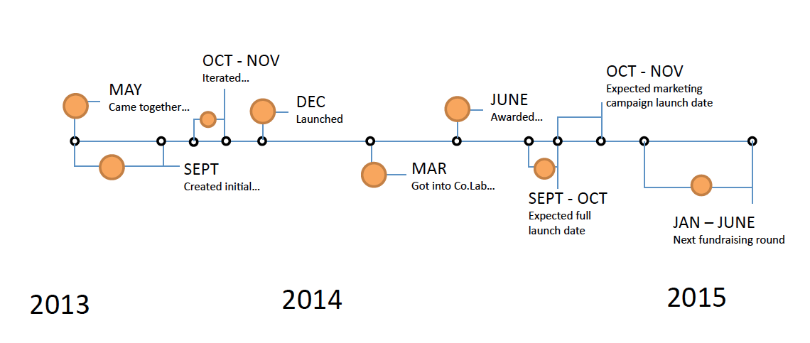
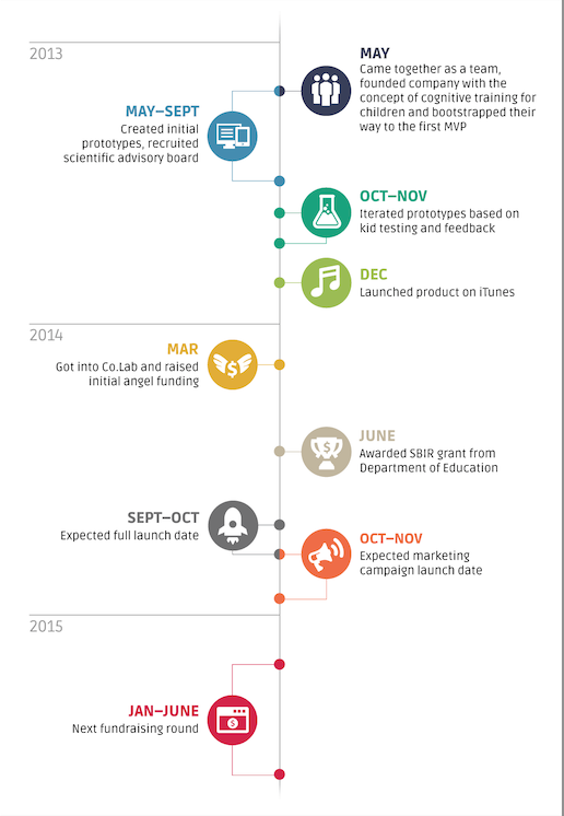
Games and Learning needed a timeline graphic for their website. The original version from the client looked like this:
So we spiffed it up with some on-brand colors and fonts (and ICONS! See tip #2 above), and made two versions so it was flexible to fit different spaces on the site.
The main version:
And a long skinny version:

Here’s one more example, which was included in a flyer for the Lily School of Philanthropy.
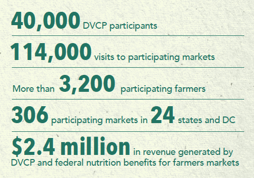
4. Try text-only infographics
Hey, I love words! (Numbers, not so much, but that’s a different story, one using my SAT scores as evidence). Especially when they’re used in combination with visuals.
But you know what, you don’t need a visual to make your data have impact. To heck with wee little pictures.
If you know the point you are trying to make, you can pull out a few words using bold type, thereby creating a sort of pull-quote or call-out or sidebar or call it what you will:
5. Offer multiple ways for readers to consume your data-laden content
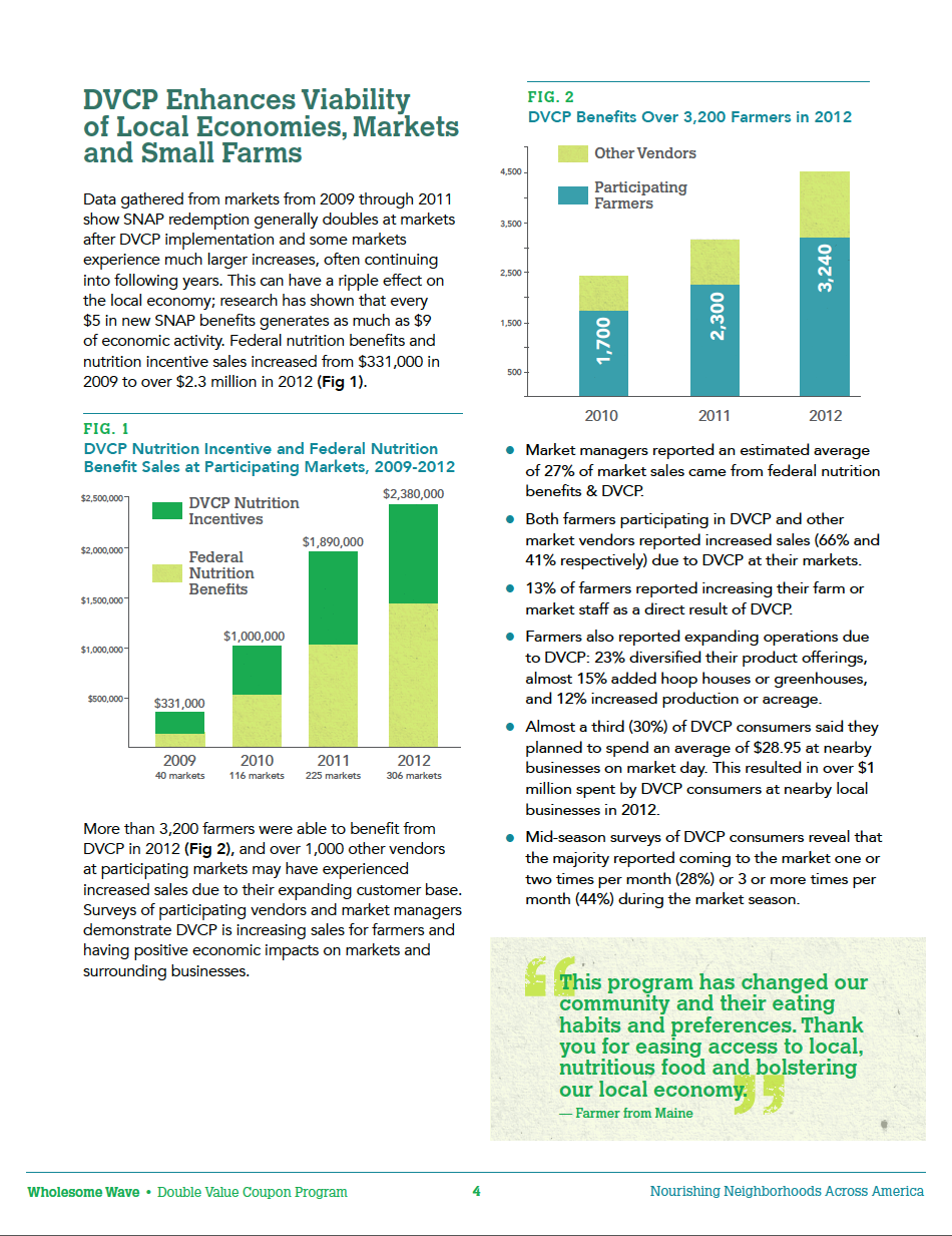
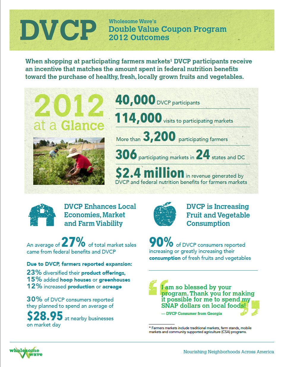
When Wholesome Wave wanted to communicate findings of their two flagship programs, Double Value Coupon and Fruit and Vegetable Prescription (FVRx), they decided to do it in three ways – a full report, an executive summary and a fact sheet. Here’s how:
- The long version (full report): a 17-page PDF, with lots of text and some charts and graphs
- The medium version (executive summary): A 7-page PDF with an equal balance of graphics, charts and text.
- The short version (fact sheet): Double-sided single-page PDF that’s mostly graphics, illustrating data findings.
So show it – don’t say it
If you looking for a way to cut through dense blocks of text or are knee-deep in information, try using small, simple infographics. It’s a great way to pull out juicy tidbits that draw readers in – by showing visually what the essence of your message is.
Want more on Visual Communication and Visual Thinking? Here's some related content for you.
Step-by-Step Guide to Planning Your Nonprofit’s Annual Report
Need to improve your annual report planning process?
Planning an annual report can be intimidating. We’ll help you get the process right and improve the final product with our step-by-step guide to annual report planning.
From Marlene Oliveira of moflow and Julia Reich.
