Every image you share says something about your organization. Your images can be completely random, or they can serve a higher function—supporting your overall brand.
Your marketing materials should have brand consistency, and so should your images! Whether they’re slathered across your social media outlets, on a website, in a blog, in your emails, brochures, or annual report … using branded visuals helps people recognize your organization so you gain recognition and support. It’s like what they used to say about traditional advertising: a customer needs to see an ad five times before it registers with them. When an image is branded, it essentially has your organization’s stamp on it.
Four(ish) Tips for Creating Branded Images
- Choose imagery that will be in keeping with your brand’s personality. Consider elements such as:
- Image style – Do you use formal portraits of a person looking directly at the camera? Or a more journalistic, spontaneous approach that emphasizes moments and emotions? Even your choice of photo filter can have an impact here – by adding light, a soft glow, warmth to colors, or a faded, aged appearance, for example.
- Type style and placement – for text that overlays the image. For example, a bold, informal handwritten typeface would be appropriate for a grassroots startup with a strong stance on issues, while a classic serif would work better for a conventional charity that’s got a rich history.
- Color palette – colors are laden with meaning. You’ll want to choose colors that match your brand.
- Designs need to be consistent across all channels. For example, if you regularly use Facebook, Pinterest and a blog, sizing will differ for each channel so you may find the need to create multiple templates (Here’s a handy cheat sheet for image sizing. And here’s an even handier infographic).
- Choose imagery that will evoke certain emotions with viewers. What those emotions are depends upon how you want your brand to be perceived.
- Be wary of sending visual mixed messages, as it can leave your audience Of course, there is a lot of creative leeway. Based on your organization’s culture and marketing strategy, determine how flexible you will be, and stick to it. Try to see the images from your audience’s perspective—as part of a bigger picture.
Imagery With Personality
So how do you use images to make your brand stand out and be seen amongst zillions of nonprofits clamoring for attention? First, you need to be aware of your organization’s personality. Here are three examples from New York City organizations.
This well-known institution acknowledges that image style plays a critical role in helping them develop a vivid and meaningful identity.
First, they’ve established the following list of adjectives to express their Personality:
- Activist – The New School has a unique history of social activism, progressive thinking and internationalism. The New School has always strived for positive and meaningful change.
- Eclectic – The New School is unconventional and different, with a constant appetite for the new and experimental.
- Open – The New School is multifaceted, diverse, and international, and it appreciates the range of ages, origins and cultures.
- Street-smart – The New School is not an insulated institution. It is part of New York City and of the larger world. The New School is urban, vibrant and dynamic.
- Articulate – The New School fosters personal expression and voice, challenging students to be in active dialogue with the world around them.
- Creative – The New School is made up of writers, thinkers and artists creating their own worlds and systems of ideas.
- Courageous – The New School, since its founding, has been a place where people aren’t afraid to take a stand on what they think is right.
They’ve also determined their Brand Promise:The New School is a lively urban university, combining design and the performing arts with social policy and the humanities, educating people who can make a difference in the world through independent, disciplined and creative expression.
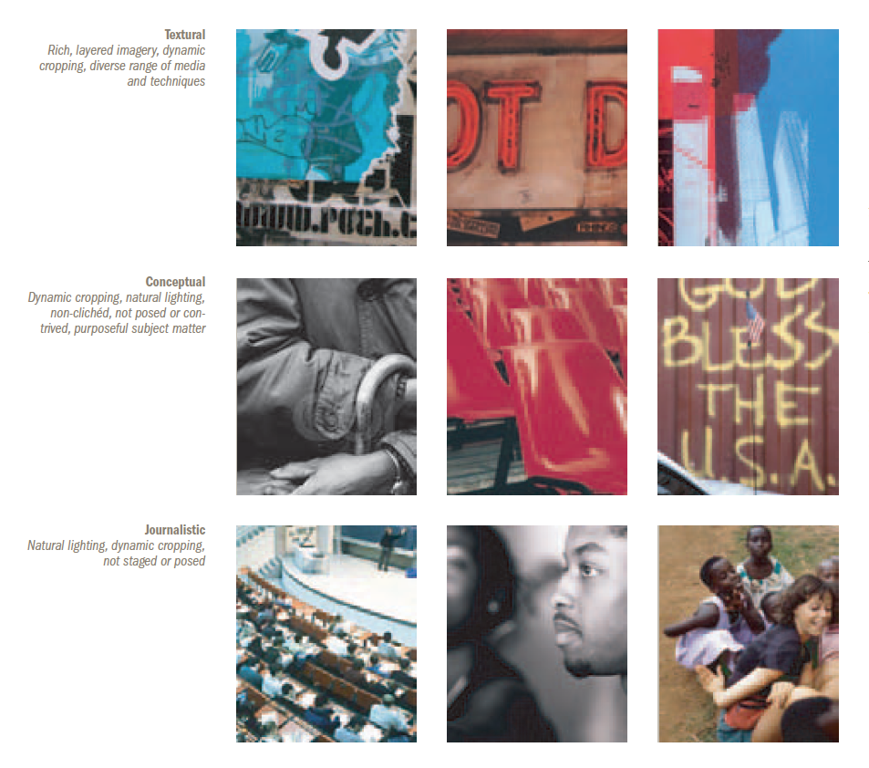
Now, what kinds of images can be used to evoke The New School’s personality, and support their promise? In their identity guidelines manual they describe three types of imagery:
- Textural: Rich, layered imagery, dynamic cropping, diverse range of media and techniques
- Conceptual: Dynamic cropping, natural lighting, non-clichéd, not posed or contrived, purposeful subject matter
- Journalistic: Natural lighting, dynamic cropping, not staged or posed
Here are some examples. These photos portray the school with a consistent eye that helps define their brand identity.
 [image credit: from The New School Identity Guidelines]
QBG has identified visuals that represent their unique institutional brand. But in their case, they’ve chosen illustrative botanical patterns instead of photography.
[image credit: from Queens Botanical Garden Graphic Standards Manual]
The black and white designs (left) can be applied using a range of scale and color to create an asymmetric pattern—such as this tupelo plant in purple and aqua (center). Other examples are the dahlia designs in a small repetitive pattern (top right), and the yellow pattern with multiple plant designs (bottom right). These varied images can be used as graphic elements on print materials, and also wayfinding or exhibit graphics—common usages for a cultural and scientific institution.
EVC is a pioneer in the youth media sector, dedicated to developing the artistic, literacy and career skills of young people, while nurturing their idealism and commitment to social change.
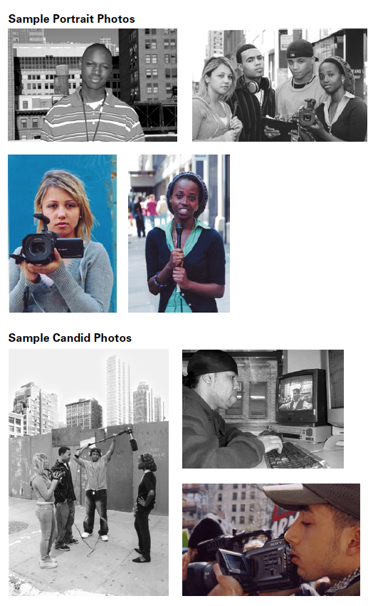
For a non-profit that uses documentary video as its primary teaching tool, you can bet that their use of photography plays a critical role in developing a meaningful identity. EVC employs portraits and candids, in black-and-white and color, with backdrops of cityscapes, buildings, and streets that reinforce their urban location.
[image credit: from Educational Video Center’s Brand Identity Guidelines by Stone Soup Creative]
…
Studies show that if you include consistent, eye-catching images in your offline and online content, people are more likely to remember and recognize you, by associating the visuals with your brand. By maintaining the same look and feel throughout your communications, and having a brand strategy in place, your brand image will be more visible and help your non-profit stand out from the crowd.
If your organization wants to boost their image, we’d love to help. Schedule a free 30-minute consultation (212-721-9764 or info@stonesoupcreative.com).
Want more on Visual Communication and Visual Thinking? Here's some related content for you.
Brand Recipe E-Book
Take charge of your brand and achieve your marketing goals!
Stone Soup Creative will help you:
- Take control of your brand
- Stand out more in peoples’ minds
- Gain supporters’ trust (and money)
- Make your marketing efforts more effective


