At Stone Soup Creative, before we begin the design process, there is a lot of information that needs to be gathered, assessed, and organized. This is Information Architecture (IA). And it’s the nerdiest—and best—thing that will ever happen to your website.
What is information architecture?
If the definition of information is “details about a subject,” and architecture is a “unifying structure,” then Information Architecture is the process of obtaining and organizing details about a website in order to create that unifying structure.
Do you feel like a nap after that? Hang in there. Even though it’s an in-depth process, information architecture can be distilled down to two important points:
1. It’s all about the user
Obtaining details about the user is crucial. We want to uncover their reasons for coming to the site; how they typically obtain information; and their level of comfort using technology. Then, once they’re on the site, our goal is to ensure they are able to find the information they are looking for in an intuitive manner, and generally in 2-3 clicks.
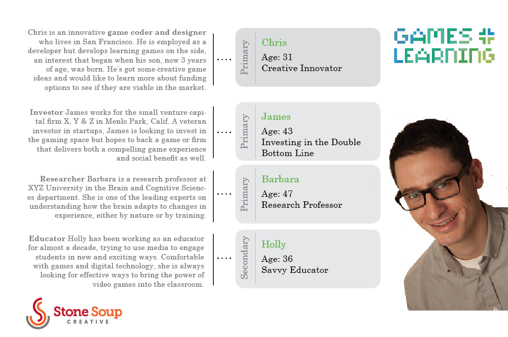
For example, on a site we recently designed – gamesandlearning.org – we learned that our users were game developers, educators, and investors who would most often use tablets rather than desktop computers or mobile phones to engage with the site. This informed the mobile strategy we developed for navigation and information relationships.
User research is useful but can be costly. With gamesandlearning.org, we opted to create simple personas that were part of a larger Brand Brief – shown below. (To learn more about creating web personas, check out this article from Newfangled.)
2. Content comprehension is king
The use of language plays a critical role in the creation of website information architecture. The writer – who is often the communications person at your organization, but just as often can be a writer here on the Stone Soup team – creates the content. Whoever is writing must make sure the language makes the most sense to the user.
For example, we’re currently working on a website re-design for the Epilepsy Foundation of Metro New York (EFMNY – here’s the old site, once the new site goes live we’ll update this post). There will be three homepage “portal” areas aimed at different kinds of site visitors. At first, they were labeled:
1. Patients
2. Caregivers
3. Providers
…which made a lot of sense to us.
But that was before we realized we had made a classic mistake of not considering the EFMNY community of users. The shorter names worked better from a web design perspective, but “patients generally don’t refer to providers. They might misunderstand, click and get lost. ‘Patients’ implies all patients when, in fact, it’s ‘adult patients.’ It’s based upon lots of health literacy trainings and knowing our community,” explains Tara Powers, EFMNY’s Director of Marketing, Communications & Development.
The portal languages were then changed to be more sensitive to the user experience.
What is our IA process like?
At Stone Soup Creative, we’ll make information architecture easy for you. It’s definitely the geekiest step in the process, but we love geeky—especially when it results in the best website for you, and best experience for your users!
The onus is on Stone Soup Creative to suss out how to create that seamless experience. We do it by asking our clients a lot of questions – first, in a worksheet we’ve prepared, then followed up with a discussion. We want to obtain answers to questions like:
- What are your organizational goals?
- What is the purpose of the new site?
- How will success of the site be measured?
- What are the different kinds of content?
- What kind of visitors will come to the site, and what are they interested in learning about and doing there?
We ask all these questions for three main reasons:
- to fully understand your organization (and your site) inside and out
- to start organizing content into categories – topics, concepts, and type (for example, text, PDFs, photographs and video are all common types of web content)
- to get a sense of the volume of content so we can plan for the future, and make the site scalable now (so it can handle future content if needed)
The user experience will also be influenced by copywriting, visual design, and interaction design. But with a strong IA foundation, your site will be right on track for success.
Are you planning to redesign your website or build a new one? If yes, we’d be happy to share our IA insight in a free, 30-minute consult.
Sources
- Information Architecture for the World Wide Web, 3rd Edition, by Peter Morville and Louis Rosenfeld
- https://www.uxmatters.com/mt/archives/2012/08/creating-a-web-site-information-architecture-in-six-steps.php
- Mark O’Brien, A Website That Works
Want more on Visual Communication and Visual Thinking? Here's some related content for you.
Brand Recipe E-Book
Take charge of your brand and achieve your marketing goals!
Stone Soup Creative will help you:
- Take control of your brand
- Stand out more in peoples’ minds
- Gain supporters’ trust (and money)
- Make your marketing efforts more effective


