Can you answer ‘yes’ to any of the following problem statements about your logo?
-
My logo has too many colors and it’s difficult to see or make it look good on different backgrounds
-
My logo has a complicated colorful gradient which is too expensive to reproduce
-
My logo looks blurry when I try to print it
-
My logo is in the wrong file format and I always get a white box when I try to place it on something
-
The shape of my logo is hard to work with
-
We need help with our logo but we can’t locate the designer who did it
Here’s ten tips with examples to help you be better at designing effective promotional materials around your nonprofit’s logo. Plus supporting advice from seasoned communications professionals who are in the trenches!
Keep the logo to just a few colors
Two to four colors is plenty. Logos with transparencies and gradients are trendy because they add visual depth and volume. The problem is that they can be difficult and costly to reproduce.
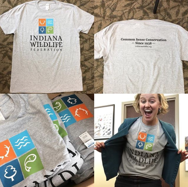
Stone Soup Creative designed Indiana Wildlife Federation’s logo with four bright, flat colors – and no gradients – so it would reproduce well on T-shirts and other #fundraisingswag. From Instagram
CASE STUDY – Learn from our mistakes!

Stone Soup Creative designed this logo for a catering company with a social mission. The “cabbage hands” originally had several shades of green, and the organization found they had trouble reproducing it. Even the words “cater to you” have a subtle orange gradient. After a few years of struggling to make it work, we simplified it for them so it was only two colors: green and orange. We used tints of one shade of green which cost less when they printed spot (Pantone) colors on a printing press.
Emily Burkhardt is the Volunteer and Education Manager at Heart of the Valley Animal Shelter. Her additional advice:
Consider how many colors your logo is very carefully. Those three colors may look great together but are they going to work on multiple backgrounds? Overlaid on pictures? If someone is designing your logo for you, get your logo in EVERY color you may ever want to have, with a clear background. You should have a white logo, a black logo, if your org is like mine and has 3 ‘institutional’ colors you should have your logo in each of those colors as well.”
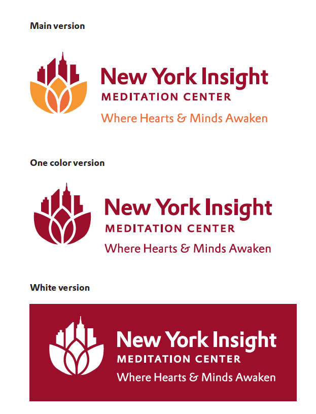
We provided three color versions – full color, red only and white – to New York Insight Meditation Center when we designed their logo
Have you inherited a complicated, colorful logo and are having problems making it work with other graphic elements? Try these layout strategies:
- Put the logo in a white box
- Use a one-color version rather than multi-color
- Avoid a busy photo by placing the logo in an area of “calm”. We did that here on the cover of an annual report:

Get your logo in multiple file formats
I don’t know how many times I’ve worked with a nonprofit that has one jpeg file that’s ten years old that can only be used on a white flyer, because it has a white background behind it” –Ryan Flynn, Inverted Triangle Design
At the minimum you will need a logo in the following file types:
- JPEG or PNG, for screen usage, in RGB color mode (I prefer the PNG because it comes with a transparent background)
- EPS, for printing, in CMYK color mode. This is a vector file that can be infinitely resized without loss of resolution, which will make it look fuzzy
Don’t allow that pushy board member who knows nothing about design to have final approval
- Approach the discussion with an open mind and an enthusiasm for change
- Express your opinions on the logos as they relate to your organization’s goals, not just your personal preferences
- Come with the ability to narrow down your selection in an efficient manner. Give clear feedback on what logo you’d like to move forward with and what, if any, changes you may have
The logo can’t communicate everything you stand for
The logo is not the only element of your brand identity. It is a part of the whole picture, but not THE whole picture. You will be utilizing the logo in context within an entire brand system, with other elements such as color, typography, images and messaging to complete your unique story.
Have a branding guide that outlines visual standards
Your logo is a valuable marketing asset. Make sure it’s used the correct way by being a good brand ambassador. Brand Standards are your handbook. This can be a simple PDF provided by your designer that includes the logo; how it should be used to achieve consistency of appearance across media and channels – with examples for stationery, social media, or whatever materials you use most often; colors; and a couple of font families (typically the one that’s in the logo plus another that pairs well with it).
Keep the logo simple
It’s a symbol, not an illustration. Pare it down to the essentials so the logo communicates what it should with the smallest amount of “linework”. How will you know if meets the simplicity test? “At a small size it should still be legible”, says Sarabeth Brownrobie, lead designer at Bee-Graphics. “You want to be able to recognize it on a poster across a room.”
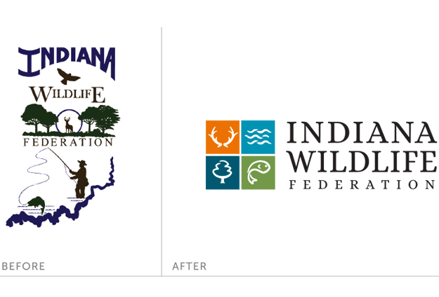
Indiana Wildlife Federation’s logo was too fussy before. We simplified it.
Get both a horizontal and vertical format of your logo
It’s entirely acceptable to have a logo in different configurations. A logo that’s a vertical “stacked” shape is the most flexible to use across a variety of applications (think about that 170 x 170 pixel Facebook profile image).
“When everyone else’s fits nicely into a grid but your long horizontal one is tiny and illegible, you’ll wish you had a vertical…Or when that square-ish version won’t fit on your promo swag’s print area, you’ll wish you had a horizontal.”
–Liesl Gray Manone, Director of Communication and Development, DRC Solutions
Horizontal version
Vertical “stacked” version
Think about how the graphic part of the logo will look without the text
If the name of the organization is removed, will just the icon look good enough to stand on its own? Can it be adapted to fit into those little spaces allotted for social media avatars?
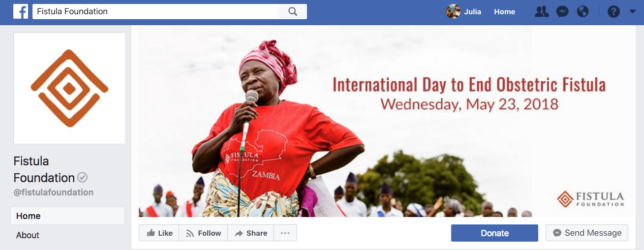
The entire Fistula Foundation logo is shown on their Facebook cover photo while the icon without words is their profile image
Get permission/ licenses for artwork and font use
Avoid huge costs like completely redoing your logo and everything that it’s on or dealing with legal costs because of copyright or trademark infringement… I have seen so many non-designers put together logos using clip art which is both a branding nightmare and a huge infringement of licensing, or fonts that aren’t licensed for that use.” -Anlina Sheng, mhrn.ca
Get a professional graphic designer or small design firm to design your logo
Small firms or solo designers can be more nimble and responsive to client requests and questions. It’s preferable to hire one that specializes in working with nonprofits since they may be familiar with unique nonprofit ‘tics’, such as the way in which NPOs are structured, make decisions, and their budget limitations. Additionally, a graphic designer with corporate-only experience may be unaware that the choices they make in their design – that everyone falls in love with – may hold pitfalls later on, such as being too complicated and costly to reproduce.
Anlina Sheng of Mhrn.ca suggests:
…[don’t use] “a board member’s kid, or a staffer who knows a bit of Photoshop, or some random person who won your logo design contest. Even if you never spend a penny on graphic design ever again, invest in having your logo professionally done. There are just so many considerations in addition to the many listed above, that you or another lay person may not consider, that could become a headache or a nightmare down the road. Money you spend initially will save you so much down the road, from little things like avoiding extra fees when getting printed materials done because their in-house graphic designer doesn’t have to spend a bunch of time fixing your logo.”
Sarabeth Brownrobie echoes this sentiment:
Your Cousin Joe will do it for a six pack of beer, but you’ll be stuck with a logo that won’t work in different formats, or one that looks unprofessional. It won’t cost you much initially, but it will cost you in donors, volunteers, and connections.”
What am I missing? Would you add anything critical? Please comment and let me know.
Note: the nonprofit communications professionals quoted here were used with permission from comments to an original post on the Nonprofit Happy Hour Facebook page, January 30, 2018
Want more on Visual Communication and Visual Thinking? Here's some related content for you.
Logo Evaluation Checklist
Use this simple checklist of criteria to either assess the state of your current logo, or evaluate a newly re-designed logo. If your logo is in the process of being designed (or re-designed) it may also be helpful to download the Logo Feedback Worksheet.
